Redesigning the Investor Dashboard: Smarter Insights, Less Friction.
Data Visualization
Role
UX/UI Designer
Industry
Banking
Duration
2 months
Background
The Wove investor dashboard MVP had usability gaps, making navigation, customization, and predictive assistance challenging. Competitive research guided improvements to usability, personalization, and investor needs alignment. The goal was to enhance efficiency for investors while reducing the burden on advisors by preemptively answering common inquiries.
Problem Statement
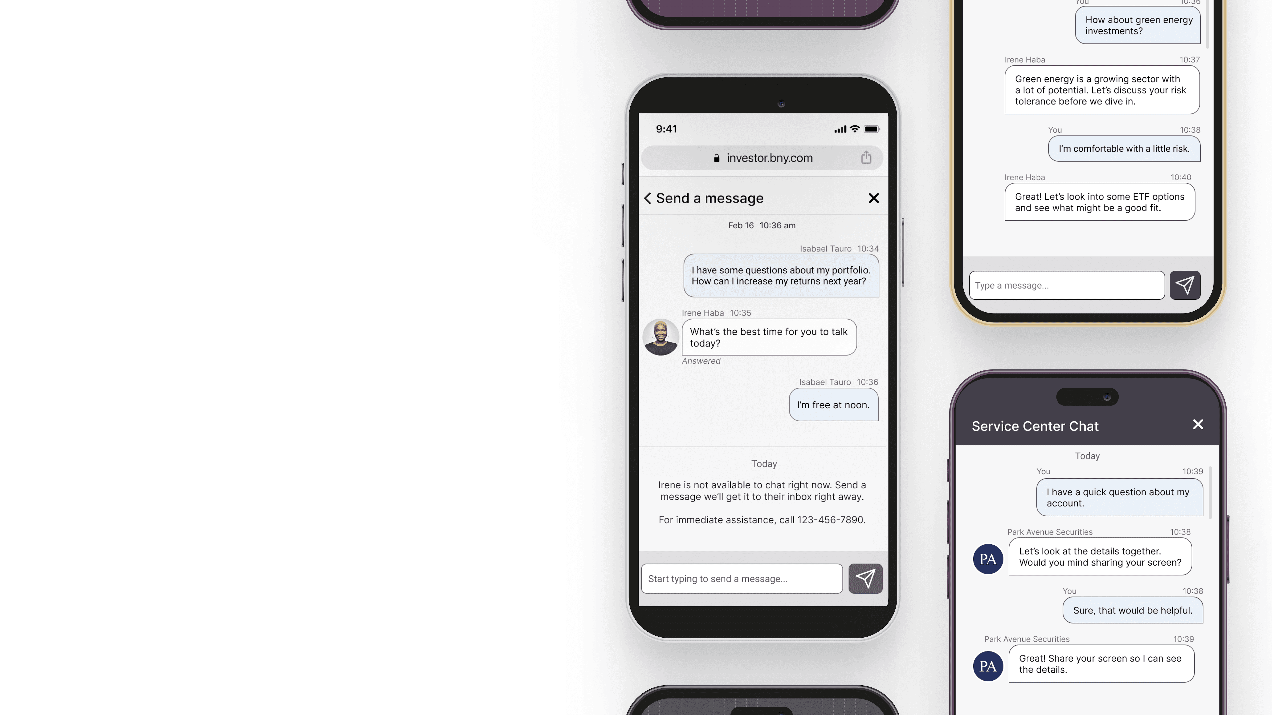
User feedback and A/B testing highlighted pain points in navigation, document access, and metric clarity. Investors needed a more intuitive layout and clearer data insights, while advisors noted the dashboard didn’t effectively reduce their workload.
Research Insights
Navigation: Users struggled to find key info quickly.
Customization: Investors wanted control over dashboard hierarchy.
Metrics: More context needed for rate of return and performance.
Actionable Features: Quick links reduced advisor workload.
Industry Trends: Leading platforms emphasized personalization and proactive features to drive engagement.
Background
The Wove investor dashboard MVP had usability gaps, making navigation, customization, and predictive assistance challenging. Competitive research guided improvements to usability, personalization, and investor needs alignment. The goal was to enhance efficiency for investors while reducing the burden on advisors by preemptively answering common inquiries.
Problem Statement
User feedback and A/B testing highlighted pain points in navigation, document access, and metric clarity. Investors needed a more intuitive layout and clearer data insights, while advisors noted the dashboard didn’t effectively reduce their workload.
Research Insights
Navigation: Users struggled to find key info quickly.
Customization: Investors wanted control over dashboard hierarchy.
Metrics: More context needed for rate of return and performance.
Actionable Features: Quick links reduced advisor workload.
Industry Trends: Leading platforms emphasized personalization and proactive features to drive engagement.
Design Process
A user-centric approach with iterative testing ensured refinements based on feedback. Competitive analysis shaped improvements, and advisors provided insights to align features with investor needs. The design team prioritized clarity, efficiency, and customization in the new dashboard structure.
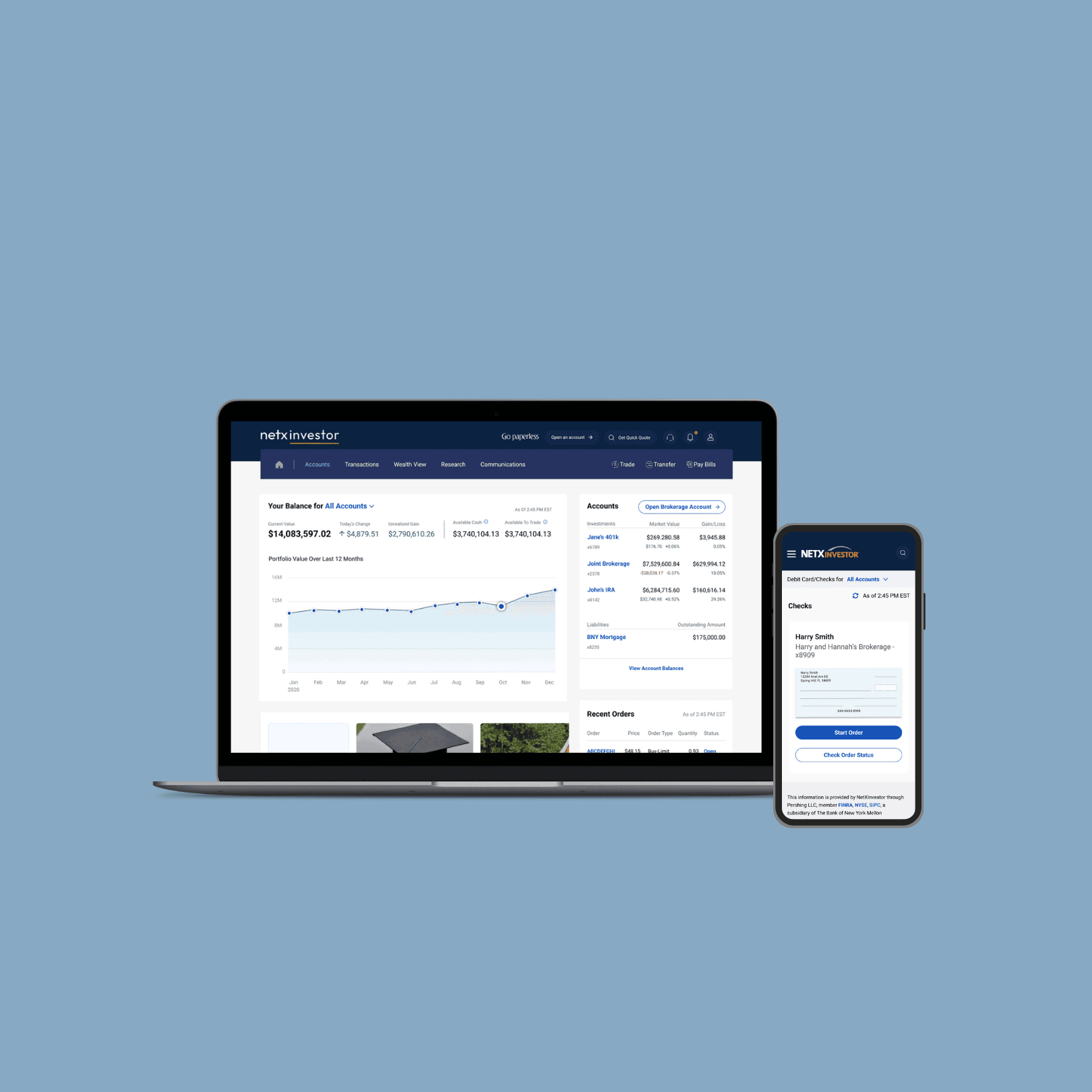
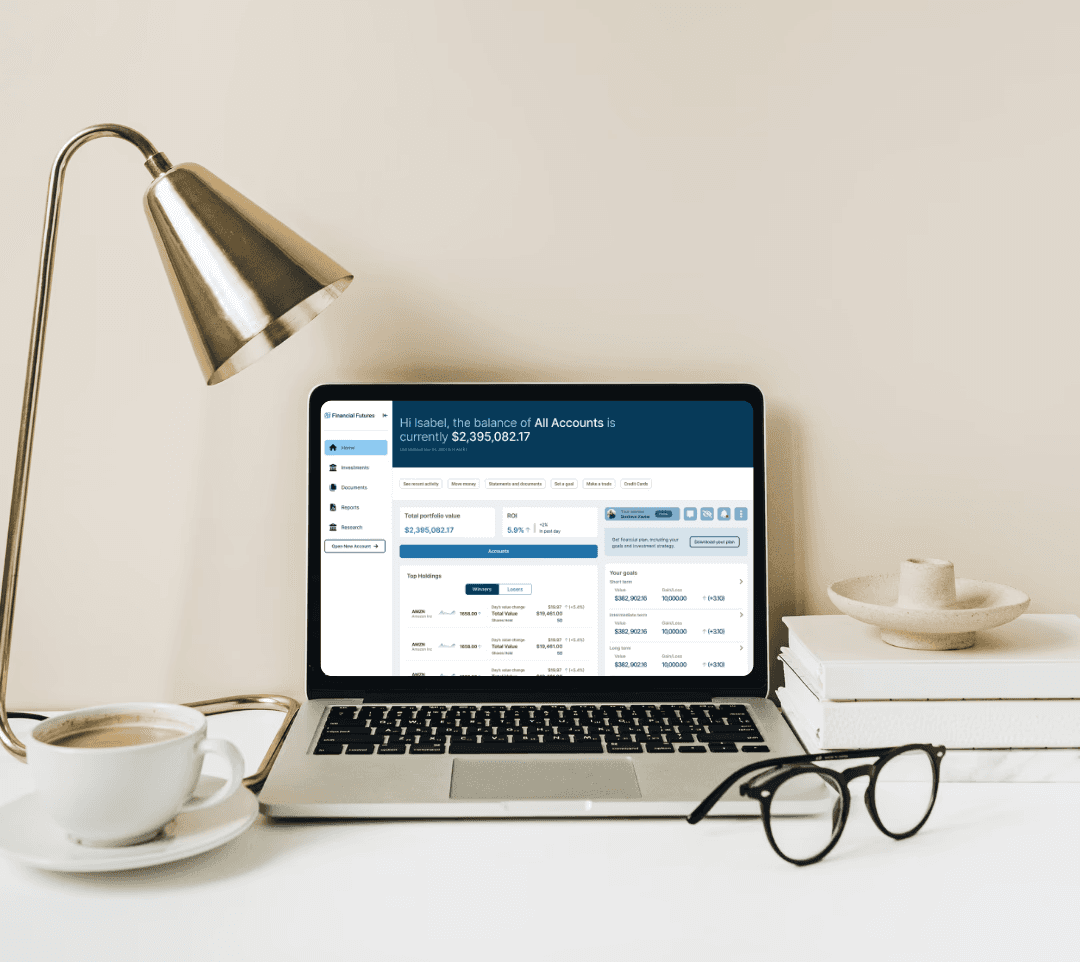
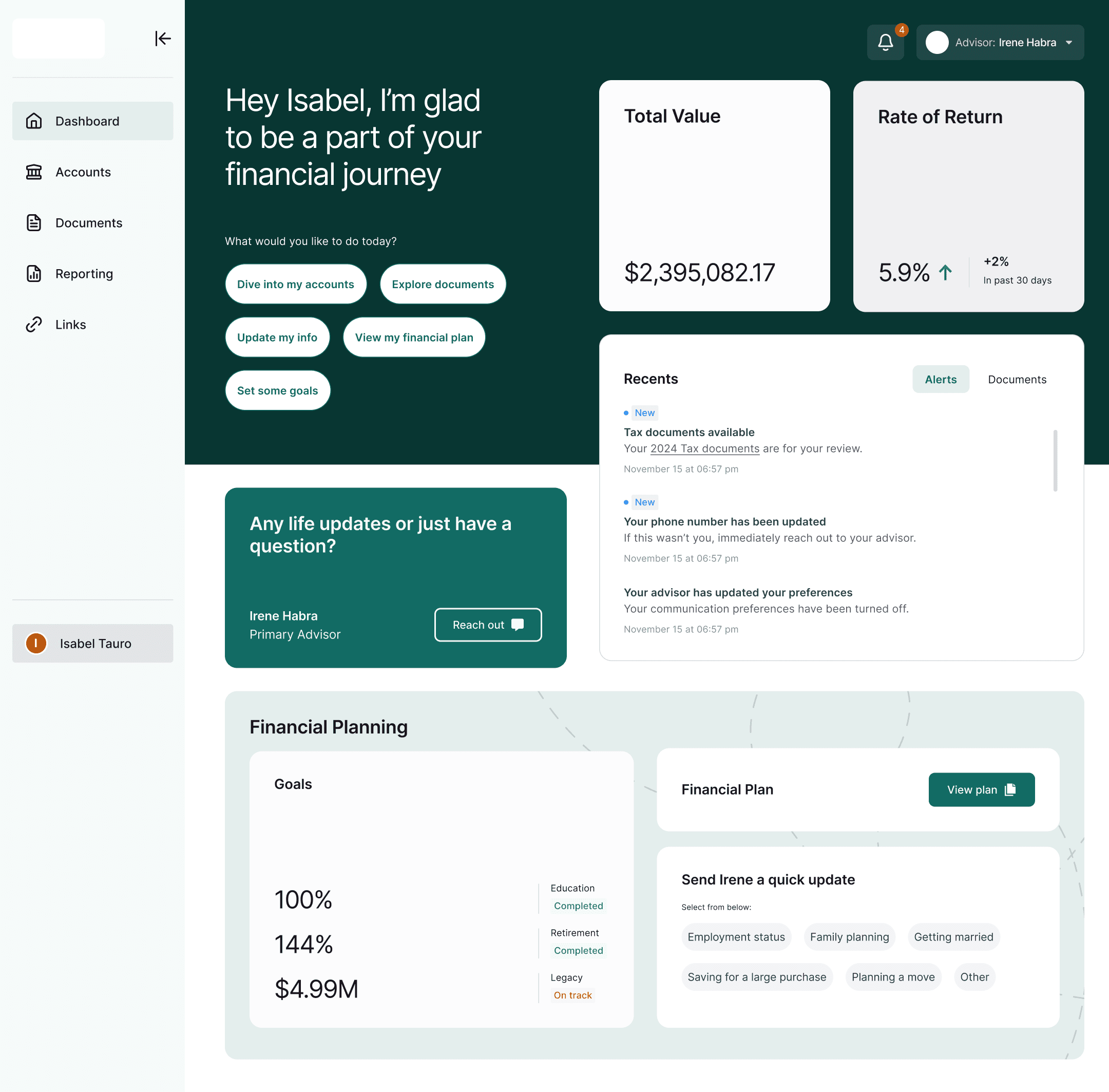
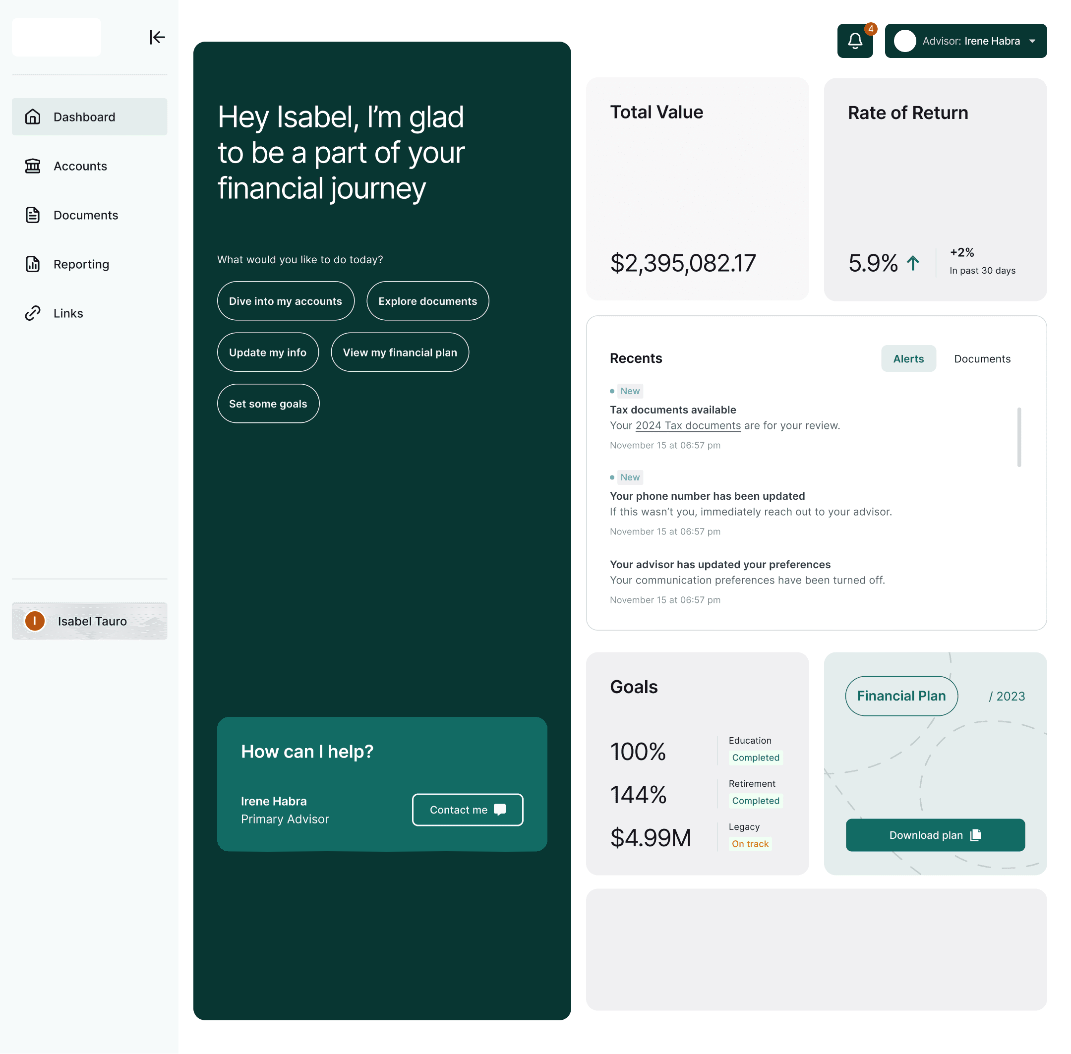
Solution
Optimized Layout: Less scrolling, clearer insights.
Customizable Tiles: Drag-and-drop personalization.
Enhanced Document Access: Improved filtering and search.
Improved Metrics: Visualized performance data with clearer context.
Quick Actions: Easy access to key investor tools.
Financial Planning Widget: Downloadable reports and insights to support long-term strategies.
Stakeholder Concerns
Dynamics that shaped the project
“We need to prioritize features that improve investor engagement while aligning with compliance and business goals.”

Legal
Helped prioritize high-impact features that balanced usability, compliance, and business needs.
“I spend too much time filtering irrelevant alerts—I need clear, actionable insights at a glance.”

Engineering
Provided feedback on alert fatigue and usability pain points, influencing streamlined notifications and clearer portfolio views.
“I want to quickly understand how my portfolio is performing without digging through complex data.”

Business
Participated in usability testing, validating the need for better data visualization and simplified performance tracking.
“We need to balance customization with simplicity so users can personalize their experience without feeling overwhelmed.”
UX + Research
Translated advisor and investor feedback into a refined dashboard UI with better customization and usability.
“Any UX changes must adhere to financial regulations—nothing can compromise security or compliance.”

Advisor
Reviewed design iterations to approve secure data handling and prevent regulatory violations.
“The design must be scalable and technically feasible—we can’t implement solutions that create system inefficiencies.”

Sales
Worked closely with UX and product teams to scope scalable solutions, flagging technical limitations early.
Stakeholder Concerns
Dynamics that shaped the project
“We need to prioritize features that improve investor engagement while aligning with compliance and business goals.”
Legal
Helped prioritize high-impact features that balanced usability, compliance, and business needs.
“I spend too much time filtering irrelevant alerts—I need clear, actionable insights at a glance.”
Engineering
Provided feedback on alert fatigue and usability pain points, influencing streamlined notifications and clearer portfolio views.
“I want to quickly understand how my portfolio is performing without digging through complex data.”
Business
Participated in usability testing, validating the need for better data visualization and simplified performance tracking.
“We need to balance customization with simplicity so users can personalize their experience without feeling overwhelmed.”
Advisors
Translated advisor and investor feedback into a refined dashboard UI with better customization and usability.
Stakeholder Concerns
Dynamics that shaped the project
“We need to prioritize features that improve investor engagement while aligning with compliance and business goals.”
Product Manager
Helped prioritize high-impact features that balanced usability, compliance, and business needs.
“I spend too much time filtering irrelevant alerts—I need clear, actionable insights at a glance.”
Financial Advisor (End-User)
Provided feedback on alert fatigue and usability pain points, influencing streamlined notifications and clearer portfolio views.
“I want to quickly understand how my portfolio is performing without digging through complex data.”
Investor (End-User)
Participated in usability testing, validating the need for better data visualization and simplified performance tracking.
“We need to balance customization with simplicity so users can personalize their experience without feeling overwhelmed.”
UX Designer / Researcher
Translated advisor and investor feedback into a refined dashboard UI with better customization and usability.
“Any UX changes must adhere to financial regulations—nothing can compromise security or compliance.”
Compliance & Risk Officer
Reviewed design iterations to approve secure data handling and prevent regulatory violations.
“The design must be scalable and technically feasible—we can’t implement solutions that create system inefficiencies.”
Engineering Lead
Worked closely with UX and product teams to scope scalable solutions, flagging technical limitations early.
Outcomes & Next Steps
The redesign tested well, with strong investor and advisor engagement. However, due to high implementation costs and competing technology priorities, it was designated a “Day 2” initiative. Given budget constraints and an aging tech stack, leadership prioritized advisor experience over investor features for immediate improvements.
To address urgent needs, key feedback was implemented in a simplified manner, reflected in the final mockup. These updates enhanced usability without requiring a full-scale implementation.
Performance Metrics
Usability: More intuitive experience with streamlined workflows.
Advisor Support: Reduced repetitive inquiries, improving efficiency.
Adoption: Likelihood of use increased from 3.5/5 to 4/5.
Future Enhancements
User Behavior Analysis: Continuous refinements post-launch.
Financial Planning Tools: More interactive options for investor insights.
Customization Expansion: Advanced personalization for individual investor preferences.
The redesigned Wove investor dashboard tested successfully and delivered meaningful improvements but remains on the roadmap for full implementation pending budget and technology alignment.